
If you read my last blog on Observability or watched the associated webinar then you will know that I’m a fan of old TV game shows. This week I want you to cast your mind back to 1997 and the TV show Blankety Blank. Imagine that you have made your way through to the Supermatch in which you have a chance to win the star prize of a dishwasher. All that lays between you and shiny clean dishes is to match your answer to that of your chosen celebrity. The host, Lily Savage reads out the phrase, “Golden Blank” and all you now have to do is match your blank word for that chosen by the celebrity. You ponder for a while before settling on “GoldenEye”, a recent movie that was a hit just a few years back. The celebrity (who it turns out was a time-travelling IT worker from 2021) gasps and slowly turns their card around to reveal “Golden Signals”. You don’t win, you are left with the ignominy of collecting the loser’s prize of a Blankety Blank chequebook and Pen, and for the next 23 years you are left contemplating, “What is a Golden Signal”?
This blog will finally answer that question.
First a little history
In 2012 Brendan Gregg defined the Utilisation Saturation and Errors (USE) methodology for analysing the performance of any system (rather than application). It directs the construction of a checklist, which for server analysis can be used for quickly identifying resource bottlenecks or errors. There is also the Rosetta Stone of Performance Checklists, automatically generated from some of these.
USE
For every resource, monitor:
- Utilisation – the average time that the resource was busy servicing work
- Saturation – the degree to which the resource has extra work which it can’t service, often queued
- Errors – the count of error events
The problem with the USE methodology is that when you have to build checklists it is not expandable to a modern microservices architecture. Therefore, it wasn’t long (2015) before Tom Wilkie of Grafana defined a new methodology with the acronym RED. He said, “The USE Method doesn’t really apply to services; it applies to hardware, network disks, things like this,” he continued. “We really wanted a microservices-oriented monitoring philosophy, so we came up with the RED Method.”
The RED method goals are to be environment/stack agnostic. This is more application focused and not resource scoped as the USE method is and duration is explicitly taken to mean distributions, not averages. The RED Method defines the three key metrics you should measure for every microservice in your architecture. In this way, the RED method helps us to understand the impact on the user/customer.
RED
For every resource, monitor:
- Rate – This is how busy my service is (throughput) or the number of requests per second
- Errors – How many errors is my service-producing or the number of those requests that are failing
- Duration – How slow my service is (latency) or the number of time requests takes to complete.
This sounds perfect. We have a methodology that works with microservices. Why do we need anything else? It turns out we don’t. If we take the Saturation signal from the USE method and combine it with the RED method, we have Latency (duration), Errors, Traffic (Rate) and Saturation. Or to put it more simply – we have the Four Golden Signals.
The Four Golden Signals
Google defined the Four Golden Signals in chapter 6 of their Site Reliability Engineering (SRE) Guide. In this document, they defined the four metrics that you should monitor before you look at anything else and they called these the Four Golden Signals. These have been adopted by many software providers and subject matter experts and have now become universally accepted as the starting point for many monitoring solutions. The successful implementation of the golden signals is key to achieving observability.
01
Latency
The time it takes to service a request or what we used to call response time. When you measure this it’s important to know what the normal performance is so you can see when you begin to see a degradation so for this reason you also shouldn’t use averages. One thing to be aware of is that a failed request may occur very quickly whereas a successful one may take a long time to complete.
02
Traffic
This is a measure of how much demand or activity is being placed on your application. The measurement will change based on what the application is so for example financial system may be transactions per second, for a web service, it may be HTTP requests per second whereas for a streaming service may be network I/O rate. Once again don’t use averages.
03
Errors
This is the rate of failing requests. These can be requests that result in an error, requests that succeed but return the incorrect content or requests that exceed a set threshold. Errors may expose bugs in the application, misconfigurations in the service, and dependency failures.
04
Saturation
This is how full your service is (or will be). This measurement depends on how your system is constrained. If it’s memory-constrained then show memory, if it is an I/O-constrained system then show I/O and for Java™ applications measure heap, memory, thread pool garbage collection. The level to monitor saturation at will depend on when you start to see degradation in performance which will probably happen before you hit 100% on the metric you are measuring. Saturation also covers predictive monitoring so you should be using tools that will show you potential saturation issues before they happen not after they have occurred, and it is too late.
How to use the 4 Golden Signals
Those of you that have followed my blogs for the last 20 years know that I’ve never been a fan of monitoring items such as percentage use of CPU and memory usage, and this has become even less worthwhile when you introduce microservices into your applications. The main reason for the Golden Signals is to instead measure signals that directly affect the end-user in resilient cloud-native architectures and to find the real performance of the system (i.e. that seen by the user).
However, to do this we need the data which means applications, infrastructure and database components must be configured to emit the relevant telemetry. The good news is that software vendors of monitoring and observability platforms are incorporating these principles into their products and collecting the data for us. If you look at the screenshot below from the market-leading Instana product you can see that on the main Application monitoring dashboard we can see Calls (Traffic or how often requests are being made), Errors and Latency. This is a standard dashboard and shows just how important these key signals are in modern monitoring systems.
In the Errors view, you can sort by Erroneous Calls to see what Service is actually creating the most errors. These calls can then be individually analysed to see what the specific issues are however I won’t go into details in this blog as it’s not relevant to the Golden Signals. If you want to look at this in more detail then see the end of the blog for details on how you can look at this tool yourself. 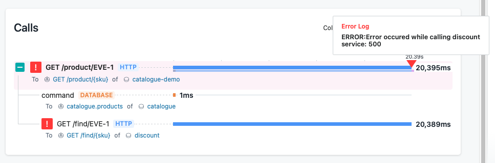
Traditionally tools have used static thresholds, but this is not that useful. We now need to look for anomalies from the normal and using averages just doesn’t do this. A more useful approach is to start thinking about percentiles. For example, alerting on the 95th percentile for latency is a much better measure of how things are performing for your users. A percentile is a measure used in statistics indicating the value below which a given percentage of observations in a group of observations fall. For example, if we refer to a 95-percentile for HTTP request response times it means that 95% of the data points are below that value and 5% are above that value. In the screenshot above you can see the Latency measurement is using percentiles (50th, 90th and 99th). This shows the values over time, but we can also see it by distribution.
This is not the only place that the Golden Signals are Evident. If you look at the Infrastructure view they are once again the prominent statistics and you can see immediately the trend of all these signals.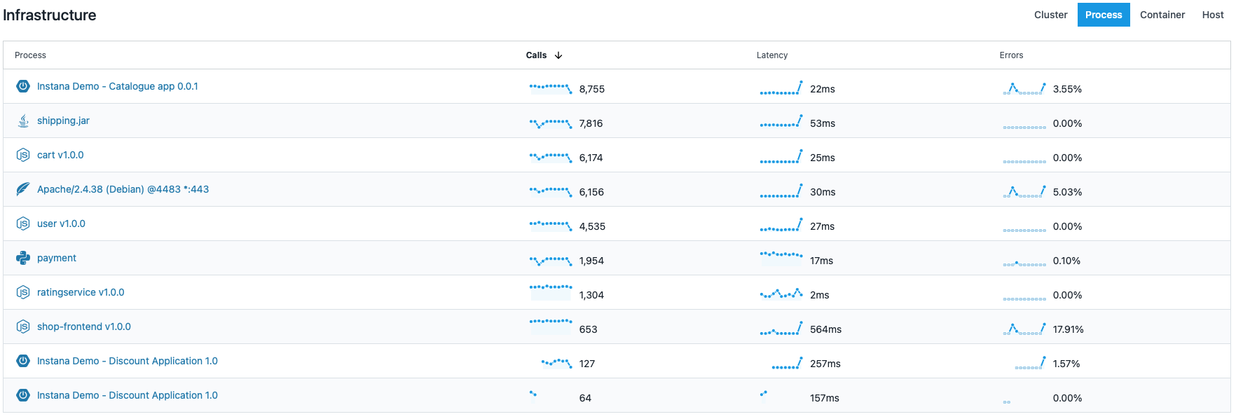
The last Golden Signal, Saturation is very contextual and is specific to the workload we are trying to monitor. For example, if we reach the CPU limit in a Kubernetes cluster we may not be able to deploy any more nodes to our application and so for Kubernetes CPU limits may be a good place to start. Saturation is the golden signal most concerned with hardware metrics and infrastructure (included under the USE methodology). Therefore, not surprisingly Instana shows Saturation under the infrastructure view.
My example is running on Kubernetes and if look at the screenshot below we can see CPU, Memory and Pods but most importantly we not only see the values over time but also how close they are to their limits (or the Saturation level) which is the thing we are most interested in.
If you want to look at how the Golden Signals are shown in Instana then click on this link and simply enter your email address and you can start using the sandbox instance immediately. Alternatively, you can see a recored demo by watching this recent Orb Data webinar.
Views: 629