
“For the time comes for directed alerts, and Dashboards shall fade or depart” – Gandalf, Lord of the Rings.
A few weeks ago, I suggested to a colleague that I may write a blog on the decline (I might have even said death) of dashboards. This was met with some shock as we deal a lot with dashboards and have created a fair few over the last 20 years, but it was something I’d been thinking about for some time. I started researching the subject (yes I do occasionally do some research) and found that I was not alone in questioning their usage. Gartner’s end of year report on the top ten trends in data analytics for 2020 listed one of these trends as the “Decline of the Dashboard”. In this, they say predefined dashboards often overwhelm users with data.
“A user must then manually explore what happened, why, and what to do about it. This time-consuming and error-prone exploration can lead to incorrect conclusions and flawed decisions and actions.”
Buoyed by this, I thought I’d write the blog and explore the state of dashboards in 2021.
A history of dashboards
Way back in 2006 Orb Data created a service dashboard for a large UK bank using the old IBM Tivoli Monitoring (ITM) 6 GUI. If you know that GUI you will know that this was quite some feat and took much head-scratching and many filters before we had something that worked. However almost straight away we realised the company in question was creating too many needless alerts, and so the dashboard was almost always red despite the applications themselves not being down or unavailable. It worked as designed but it didn’t fulfil its purpose of giving a high-level overview of all the company’s services.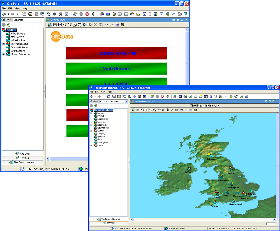
This prompted a blog I wrote in 2011 called Events, my dear boy Events in which I explained the dangers of not collecting and defining the correct alerts. More recently, in my last blog on Observability I discussed another issue known as Watermelon dashboards. This is where the dashboard reports everything is ok (green) but in reality, there are lots of issues going undetected underneath (red). In both these instances, the dashboards are not useful.
After our experience with the ITM 6 dashboard, we started working with IBM’s Tivoli Business Service Manager (TBSM) tool. This surely was the answer. Instead of each alert having the same weight in the dashboard you can build up service models so that, for instance, a web server cluster is not marked as unavailable if one of the 7 nodes failed.
This was great as long as you could get a clear map of how the service worked and the effect each component had on the service if it was degraded or unavailable. The bigger the service the more complex this work became. I was once shown the service map of an internet banking service for a large bank printed on an A0 piece of paper and the number of moving parts was extensive. This meant that often when you built a map in TBSM it was generally out of date before you had even finished. Then came Tivoli Application Dependency Discovery Manager (TADDM) which allowed the automatic building of models so that they were always up to date but even with this the discovery of every component still needed credentials and some manual input. Even in the perfect scenario where we were given every credential and access through firewalls (this never happened) we still had to manually define the weight of the discovered element in the service, and we were back to square one.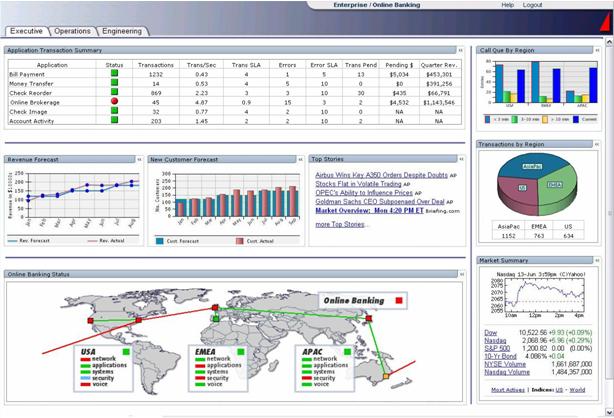
Another issue was the audience for the dashboard. Managers love dashboards that simply tell them that all their key services are up and running whereas operators need to see more detail. Then what about the DBAs and the Linux or Windows administrators? Do they need dashboards that just show them their own silo? Once one team has got one you end up creating many others and if they are useful you will need to keep updating because one new alert could invalidate all the work you have done, and it will require yet another filter change. But who’s job is it to do this update? The tools team or the team or the Subject Matter Experts? In most cases, these dashboards are not changed, and their initial usefulness is diminished. This often leads to siloed tools being bought because of the inaccuracy of the dashboards and another tool being added to the many that need to be maintained, and there is now little hope of creating a graphical overview of the service and root cause analysis is next to impossible.
Back to the future
You are probably thinking that times have changed, we now have AI, and dashboards have moved on. That’s true and more recently I’ve been spending a lot of time looking at Watson AIOps AI Manager. This product gives a new dynamic user experience where the dashboard plays a minimal role. Instead, it uses an open platform that directs its data to collaboration tools such as Microsoft Teams and Slack. This bypasses the traditional process of an alert being sent to an Event Tool and then that event being viewed by an operator who will often manually decide if the alert is worthy of escalation to a Service Desk tool or a call-out to an engineer. The design of Watson AIOps AI Manager is to automate this procedure and using AI create an incident in ServiceNow (for example), then send information regarding the incident directly to the engineer in their collaboration tool of choice and embedding all the pertinent information they will need to debug and resolve the issue. The use of collaboration tools allows the engineer to involve other people and because they routinely use these tools on their desktop the incident is seen and dealt with immediately. AI Manager lets the user see the potential impact of the issue (blast radius), the originating entity of the problem, a list of similar issues and recommended actions all in one view no matter what tool the data is coming from. AI Manager also has the ability to offer Assisted Insights using AI to analyse the data to find a root cause and Suggest Actions via AI models to analyse large amounts of data to suggest what action to take. The whole experience is based on not having to first start in a predefined dashboard but instead exploring dynamic data stories.
Last week IBM launched Watson Orchestrate which uses a natural language processing (NLP)- interface chatbot to allow the user to initiate a process with an ad hoc question and get the answer to that question, as well as related insights. Insights that may well have been consumed in a dashboard until very recently.
Gartner in their aforementioned report agrees with this approach. They think that time spent in predefined dashboards will be displaced by “automated, conversational, mobile and dynamically generated insights that are customized to a user’s context and delivered to their point of consumption”.
No more dashboards?
Watson AIOps shows that the concept of creating and maintaining hundreds of dashboards is outdated and we should now be aiming to direct alerts with the required data directly to the subject matter expert. However, despite all this in my view, there is still a place for some dashboards. The key is to create as few dashboards as needed, with as much automation built-in for managing those dashboards. This is the approach that Instana has been working on and have made it easy to create a set of predefined dashboards that require zero maintenance. These dashboards are automatically created whenever a user defines an Application Perspective (AP) which are based on regular expressions that automatically and continuously update the contents. Coupled with this, the new Observability platforms use automated analysis to identify and surface those critical changes faster than a user can manually uncover them. This is only possible when the data collected is rich and is collected at short regular intervals (often 1 second). See my blog on Observability platforms to understand the data that needs to be collected.
Another thing that Instana does well is to allow the user to explore the data to get the insights that are needed. In this way, dashboards become tools for people to do their jobs rather than something that is stuck on a big screen. Another product that does this well is Humio. You can create nice dashboards in the product, but the initial dashboard is a conduit to allow you to get to the issue and allows the user to dig into data in an easy step by step approach. First detecting where the bulk of the errors appeared and then digging into the granular detail to find the issue. If you find some path to the data that is useful you can save this as a dashboard. 
In summary, do I think the dashboard is in decline? The use is certainly changing; however, it is likely that the elements displayed in dashboards will remain but the way they are consumed will be more dynamic. This change will mean that data literacy will need to be built into the organisation to accelerate trust and adoption of augmented analytics capabilities, but these changes ultimately will prove a game-changer to the productivity of users.
I promised I would come back to Watson AIOps AI Manager’s lack of dashboard. As of 3.1, the latest release has introduced a dashboard called the Application Hub which gives an application-centric insight, enabling rapid visualization of different application components. This is a nice overview, but time will tell how much it is used and by who. It would be interesting to know who drove this change, the customers who expect a dashboard in the product or IBM themselves?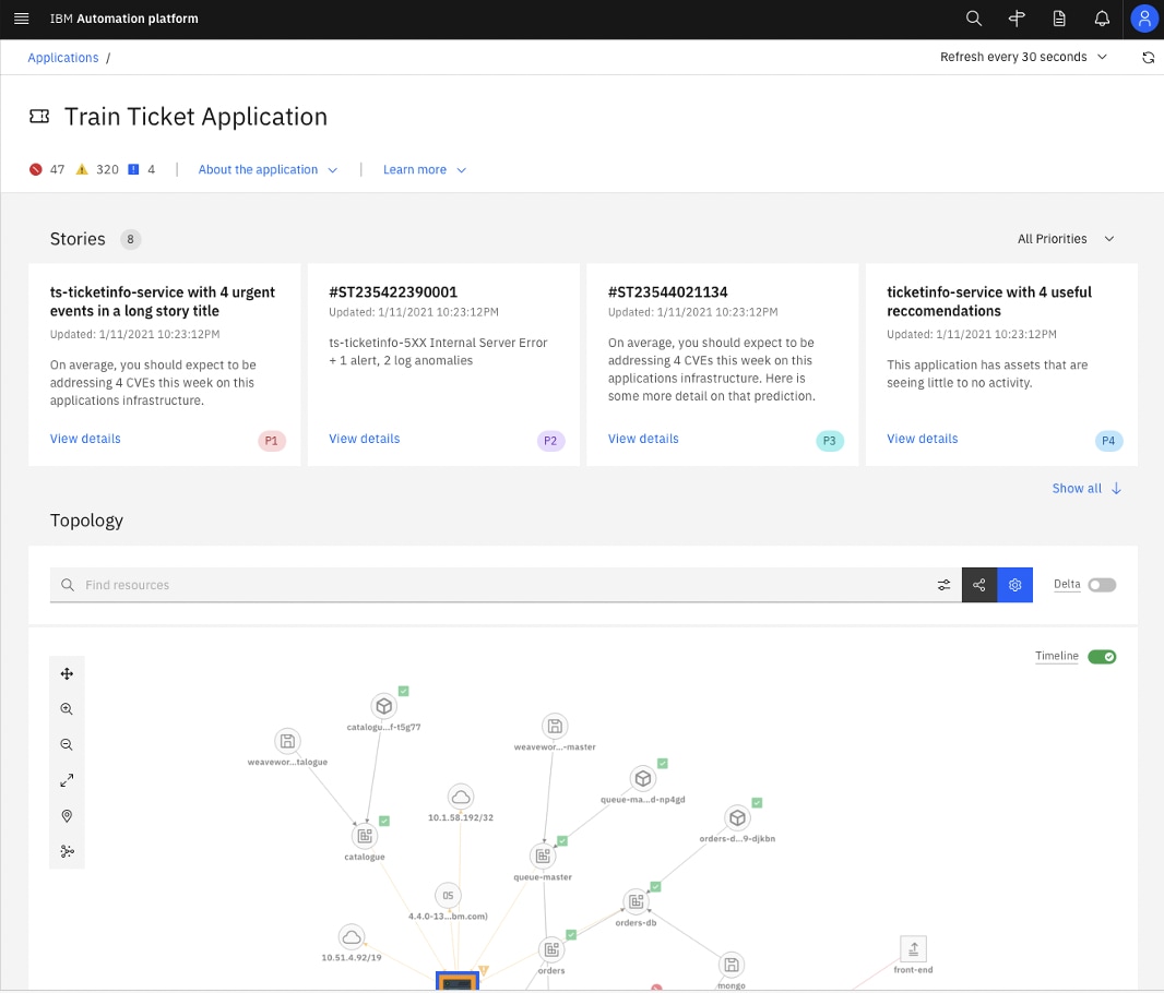
Views: 659